Revolutionising the car insurance industry with a seamless, transparent, and affordable platform powered by data-driven customisation and third-party integrations.
Context
InsureIQ is an AI-driven car insurance platform that aims to simplify, personalise, and reduce the cost of purchasing car insurance in the UK. With a market plagued by rising premiums, lack of transparency, and overwhelming complexity, InsureIQ introduces a seamless and data-powered approach to reshaping how consumers—particularly younger, tech-savvy individuals—interact with insurance.
Details
Time Frame:
Nov 24 – Feb 25
Role:
UI/UX Design, Usability Research, PPT Creation
Involvement:
Web Interface, Visual Design
Overview
The objective of this project was to conduct competitive market analysis, perform in-depth UX research, and design a modern, intuitive user interface tailored for the UK car insurance market. Our goal was to solve real user pain points—rising premiums, lack of transparency, and an outdated digital experience—by delivering a next-gen platform that prioritises personalisation, ease of use, and affordability.
Through a combination of user behavior analysis, competitor benchmarking, and AI-driven customisation, we crafted a platform experience that caters to tech-savvy and price-sensitive users in the UK, especially younger drivers seeking transparency and control over their insurance policies.
Challenge
Despite being one of the largest markets in the UK, the car insurance industry remains outdated, opaque, and user-unfriendly—particularly for younger, digitally native consumers. Our challenge was to reimagine the car insurance Quote experience by addressing three core issues:
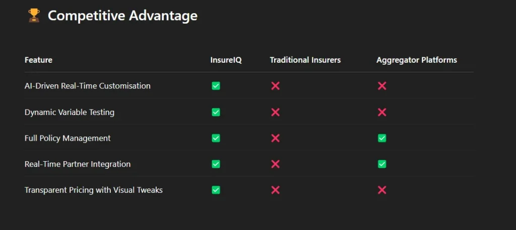
The InsureIQ Solution
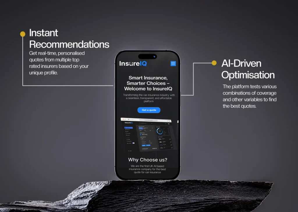
InsureIQ offers an AI-powered, customisable, and real-time car insurance platform that addresses industry pain points head-on.
Core Features:
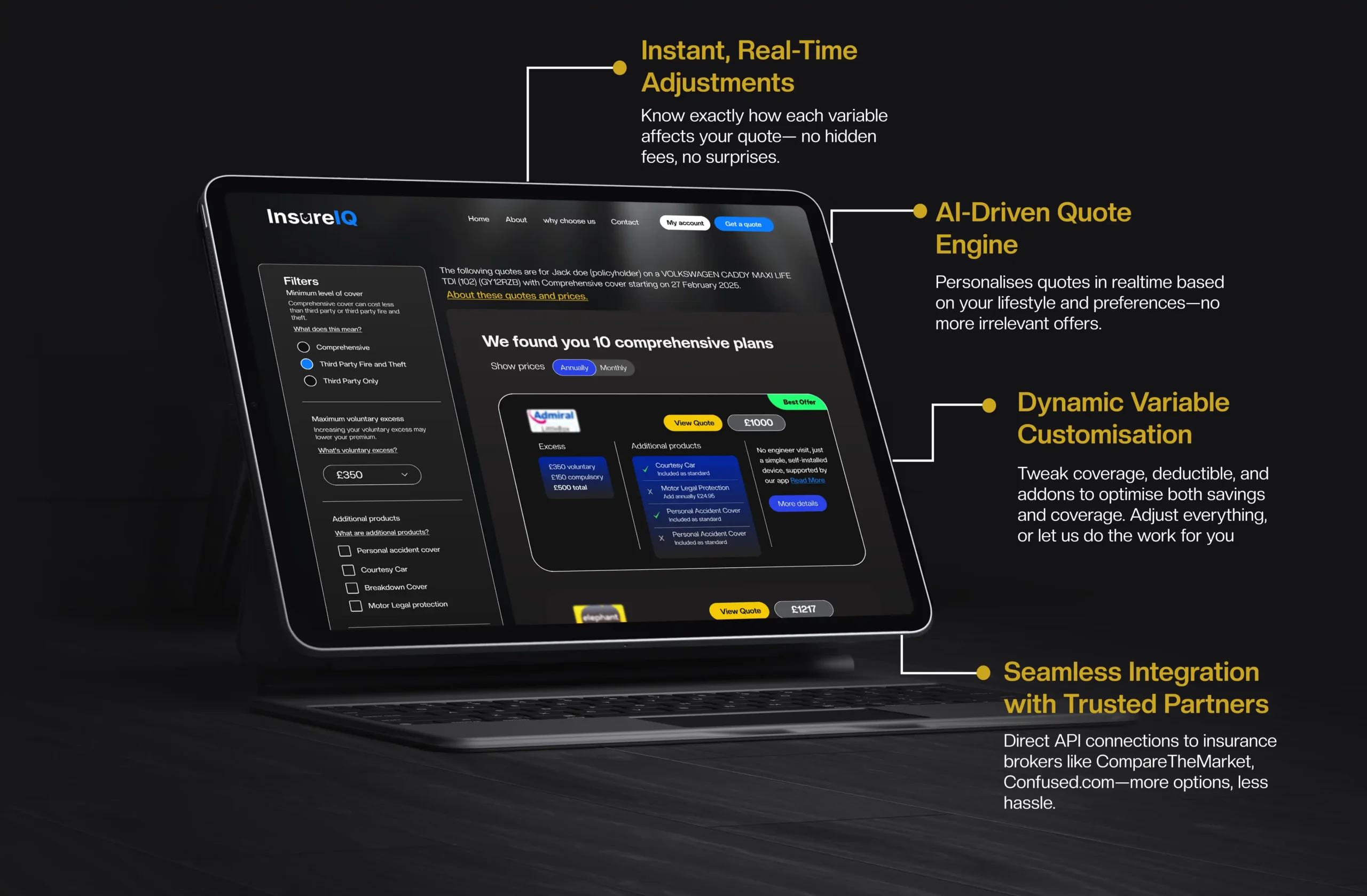
- AI-Driven Customisation: Tailors quotes based on variables like parking habits, vehicle usage, and annual mileage.
- Seamless Comparison: Integrates directly with top insurance aggregators (e.g., CompareTheMarket, Confused.com) to offer real-time, affordable quotes.
- Data-Driven Savings: Tests various coverage combinations and deductibles to surface the most cost-effective policy.
- Dynamic Variable Customisation: Allows users to instantly tweak coverage, add-ons, and deductibles to see how they impact price.
- Real-Time Adjustments: All calculations happen live, based on user input, giving personalised recommendations within minutes.
Target Audience
Primary Segments:
- Millennials & Gen Z (Ages 17–44)
Price-sensitive, tech-native individuals seeking transparency and ease. - Tech-Savvy Shoppers
Users who prefer digital-first tools to compare, customise, and purchase insurance. - Cost-Conscious Consumers
People actively looking to lower their monthly expenses without compromising coverage.
Market Opportunity
- UK Car Insurance Market (2024): Valued at £21.9 billion
- Growth Trend: Premiums up 82% since Q1 2021
- Market Gap: 42% of users only shop for insurance once a year—significant space for smarter, more frequent evaluations
- Expansion Potential: Plans to scale into Europe, US, and other insurance verticals like home and life.
🧠 Approach & Strategy
We approached this project through three primary lenses:
1. 🔍 Competitive Research
- Analysed leading platforms like Confused.com, CompareTheMarket, and MoneySupermarket
- Identified UX gaps, business models, and feature limitations
- Benchmarked pricing transparency, customisation tools, and user journeys
2. 👥 UX Research
- Targeted UK drivers aged 17–44
- Explored user frustrations with insurance complexity
- Conducted user persona creation and journey mapping
- Prioritised clarity, real-time feedback, and personalisation
3. 🎨 UI/UX Design
- Developed a sleek, modern, and mobile-first interface
- Emphasised variable tweaking, transparent quoting, and real-time recommendations
- Simplified complex insurance processes into bite-sized, guided flows

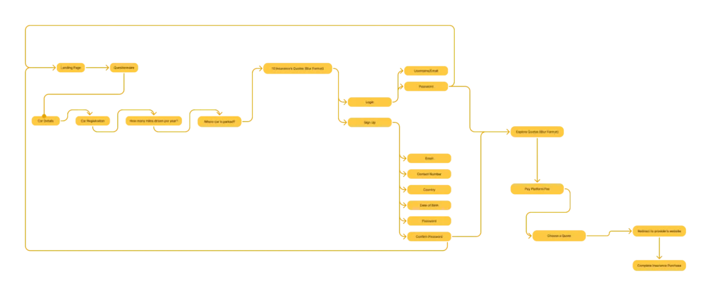
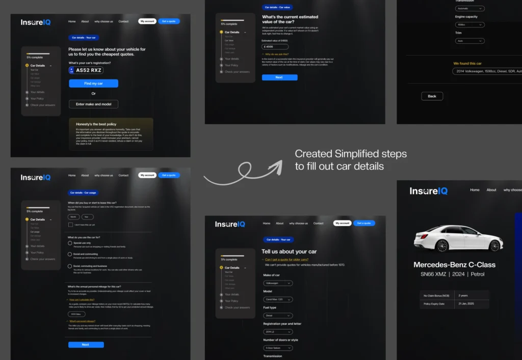
Car Details Flow – Modern UX for a Complex Process
🔄 Created Simplified, Step-by-Step Pages for InsureIQ
Insurance forms are notoriously overwhelming. My goal with this flow was to remove friction, reduce mental load, and boost clarity—so users could confidently enter their car details without second-guessing or dropping off mid-process.
🧠 The Problem
Traditional insurance forms ask for a large amount of vehicle and usage data all at once, often resulting in:
- Confusion around what each field means
- Skipped or incorrect entries
- Frustration from unclear design or technical terms
Solution
I designed a progressive, modern step-by-step flow that:
- Breaks down the form into logical, easy-to-digest steps
- Uses contextual tooltips and plain-language labels
- Offers smart autofill suggestions where possible
- Adds a visual progress tracker (left-side panel) to orient the user throughout the journey
🧩 Key Steps & UX Highlights
- Step 1: Vehicle Registration Lookup
Users can simply input their car’s registration number, and the system attempts to autofill details. For those without a reg number, manual entry is offered as a fallback. - Step 2: Car Value Estimation
Clear copy explains why this data is needed, paired with editable fields and smart defaults (e.g., “£4500 estimated value”). Helpful FAQs like “Why do we ask this?” are included inline. - Step 3: Car Usage Questions
Users answer simple MCQs about their daily use—personal, social, commuting, or business—and mileage ranges. Text is informative yet concise, with highlighted tips for accuracy. - Step 4: Detailed Specs
This includes engine type, fuel, transmission, and doors—all designed with dropdowns and smart inputs that guide the user rather than overwhelm them. - Step 5: Final Review & Summary Page
A sleek summary page with a car image displays the entered details—adding visual satisfaction and trust before submission.
🌈 Design System & Visual Language
Dark UI with high contrast and clear typography for accessibility
Blue CTAs and soft glows to make interactions inviting
Minimalist form fields that avoid clutter
Responsive, card-based layout to maintain visual hierarchy
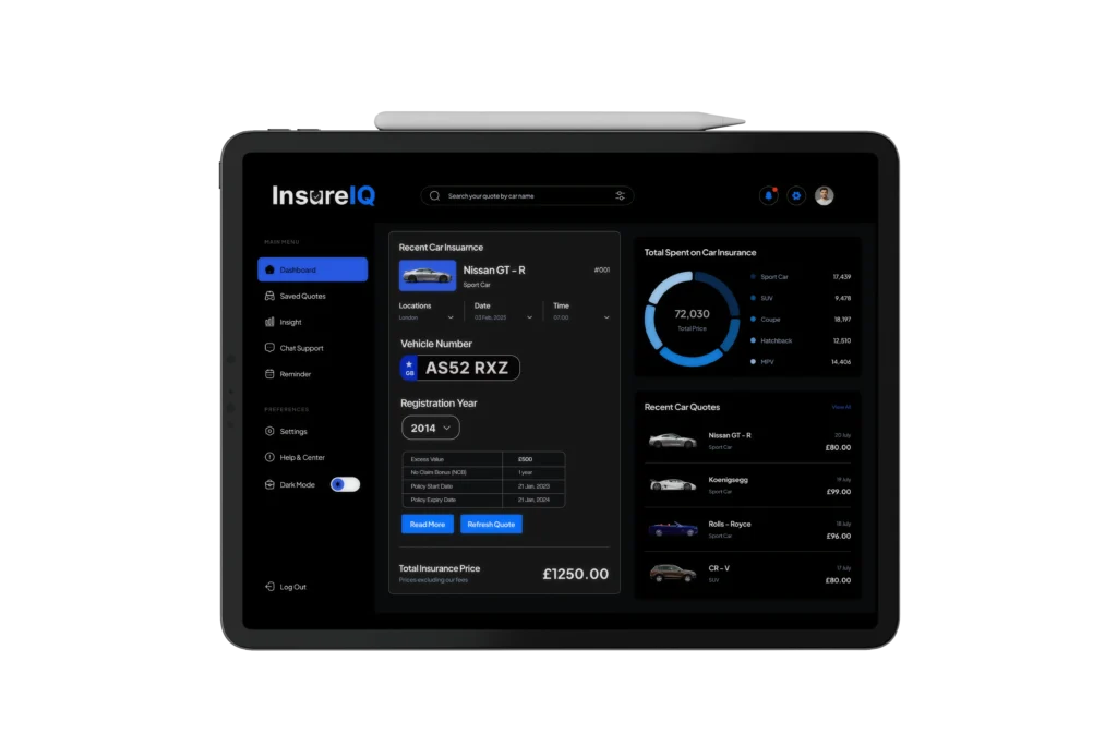
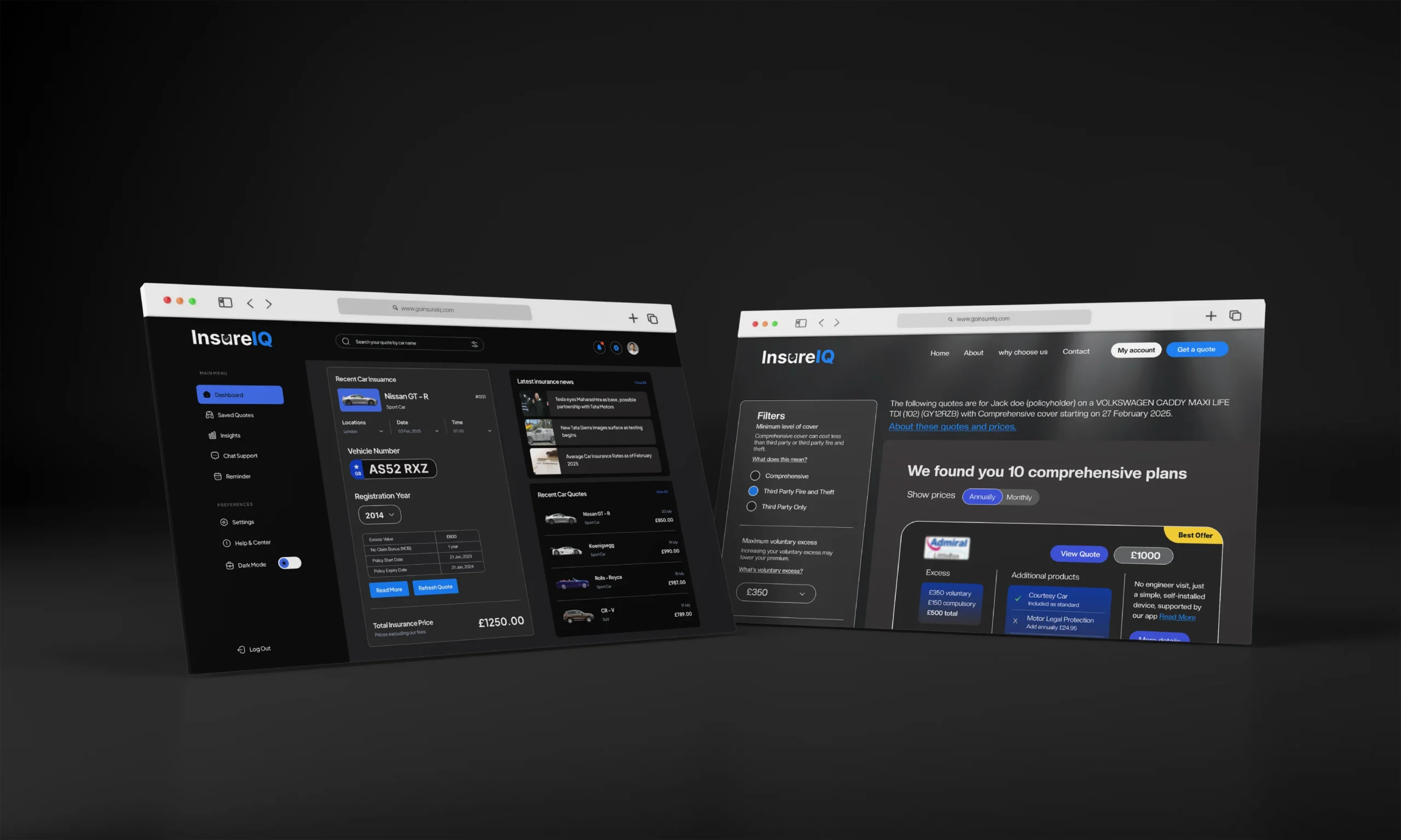
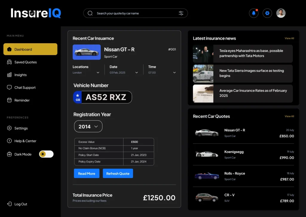
User Dashboard
The user dashboard is a central touchpoint in the InsureIQ ecosystem—where users manage payments, saved quotes, upcoming renewals, and policy details. My goal was to design an interface that offers clarity, accessibility, and efficiency, while solving for the complexity often found in traditional insurance platforms.
Phase 1: Wireframing – Structuring Complexity
InsureIQ Wireframe – (User Dashboard)
I began with a low-fidelity wireframe to explore layout structure, hierarchy, and feature flow. The dashboard was segmented into three key modules:
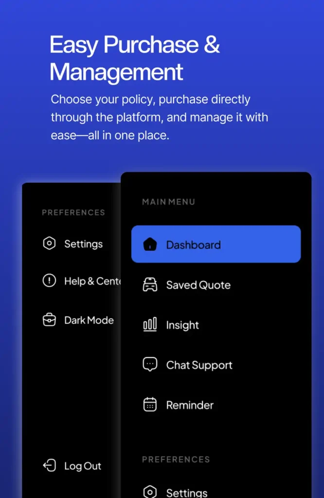
- Main Menu Navigation (Left Pane): For quick access to key sections like Saved Quotes, Chat, Preferences, and Reminders.
- Central Pane: Designed to display essential car insurance details, including quote data, vehicle info, and policy timelines.
- Right Panel: For supplementary content like car news updates and recent quote history.
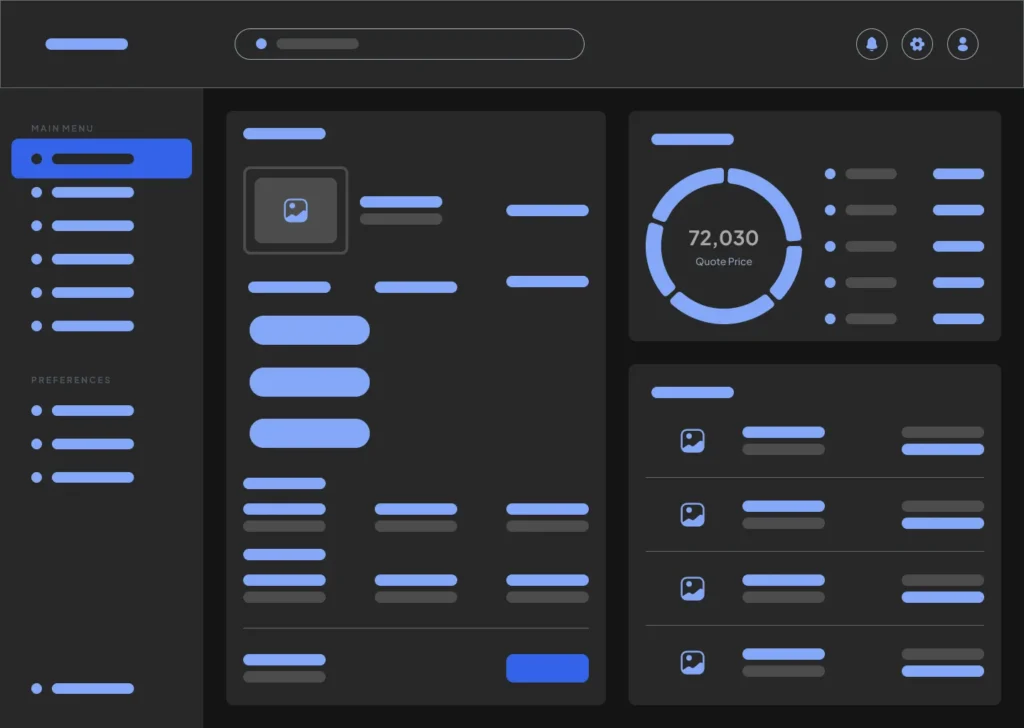
The purpose of this wireframe was to:
- Simplify decision-making with clean groupings.
- Ensure logical hierarchy and easy navigation.
- Lay the foundation for seamless data visualisation and quote comparisons.
Phase 2: Final UI – Building a Premium, Human-Centered Experience
InsureIQ Final UI – Polished User Dashboard
After usability testing and stakeholder feedback, I moved to a high-fidelity UI built with a modern design system that reflects trust, transparency, and simplicity.
Key Highlights:
- Elegant Card Layout: The central module shows real-time quote data, vehicle information, and registration year in a card-style interface, making it visually digestible.
- Interactive Tools: Features like “Refresh Quote” and “Read More” empower users to stay updated and informed at any time.
- Real-time Data Display: From recent car quotes to the latest news—everything is updated dynamically to help users make decisions with confidence.
- Custom Toggle Options: Users can seamlessly switch to Dark Mode and access preferences under the “Settings” tab.
- Bold Typography & Contrast: Carefully chosen font and color contrasts improve readability, especially for key information like insurance pricing.
📈 Outcome
The user dashboard design:
- Simplifies how people interact with their car insurance data.
- Enables instant quote comparisons.
- Builds trust with transparent and well-organised information display.
- Enhances the digital experience for UK-based users seeking smarter, quicker insurance solutions.
✅ Conclusion
Designing the InsureIQ website was a deep dive into creating a seamless, modern, and trustworthy user experience for a traditionally complex industry. From the landing page to the step-by-step quote flow, every screen was built with clarity, confidence, and conversion in mind.
I focused on:
- User-first UX that simplifies data input
- Visually engaging UI with a clean, dark theme
- Streamlined journeys that reduce cognitive load and increase completion rates
The final product reflects InsureIQ’s vision—a smart, hassle-free insurance platform that users can actually enjoy interacting with. Whether it’s getting a quote, comparing options, or reviewing policies, the experience now feels fast, modern, and personalized.
This project sharpened my skills in product thinking, UI/UX design, and form experience optimization—proving that even insurance can feel intuitive and beautifully designed.